Test 2: Introducing shopping by product categories
How might we design a way to shop that's intuitive for new/mass market users but still community-centric for enthusiasts?
While the first effort aimed to make it more clear how to shop by communities and increase exploration, we knew that our "community shopping" model was non-standard and confusing to people unfamiliar with Massdrop, online communities, and forum culture.
We focused on 3 new user pain points the product manager had identified from user feedback before our project kickoff.
We framed our challenge as...
New users who come to Massdrop to shop are confused by our "shop by communities" concept and can't easily find products they're interested in.
We believed that by allowing users to shop by communities and product categories, new users would better understand how to shop and buy more products, while existing users could still enjoy shopping by communities.
Success metrics: Increase buyer conversion & new user retention, keep flat or increase existing user retention
I started by creating a task flow to visualize the user journey and how our proposed solution would improve their experience.
Introducing categories would provide an alternative to community-based shopping, a familiar and accessible e-commerce experience, and offer greater product visibility through broader groupings.

Task flow visualizing decision points and actions when users come to shop. Based on a medley of site analytics, lean user testing, and empathy.
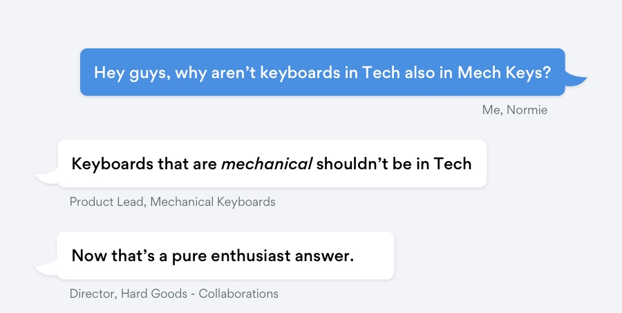
While categories seemed like an effective solution, I was relatively new to the squad and wanted to understand why products weren't cross-listed. So, I met with members of Massdrop's Goods/Product teams to learn why and concept test our idea.
I learned that we don't cross-list, so as not to dilute individual community experiences, took away a deeper understanding of our enthusiast users’ goals and values, and in the process, found out I'm a "normie."
These conversations and activities provided richer context about Massdrop's growing pains—creating experiences for new users, while respecting its core enthusiasts users' values. Before jumping into my tools, I identified a few goals to guide what kind of experience my designs should create to be successful.
I worked on this effort as Test 1 was still in-progress and results not yet significant. While not ideal to build on our design without validated results, we were on a tight timeline and aimed to build a minimum viable feature to test our hypothesis.
My challenge was to design a way people could shop by communities and categories from our new lefthand navigation. I explored interaction patterns for desktop and mobile through quick sketches and high fidelity mockups to visualize them.
(Desktop designs only for brevity.)
We decided to test this interaction.
We reviewed designs with engineering and the CEO and decided to test the toggle interaction. This method gave communities and categories their own spaces to live (minimizing confusion), didn't overwhelm with choices, or hide options behind dropdowns.
Building on this direction, I developed a few variations of the toggle UI. We settled on the last option because it had a clearer affordance, created visual interest against our mostly angular site, and felt fun to use.
We still had some things to figure out, but the product manager and I got buy-in to develop and test the concept below. Here's an overview of my design decisions and an animation of the prototype:
"Should clicking the toggle change the menu + page content, or just the menu?" - Product team member
While I believed clicking the toggle should take users to separate pages for clarity and speed, I knew this was still an assumption. So, I prototyped an alternate flow and split tested the two options with 6 officemates as proxies for various types of users.
liked the menu + page content option
liked the menu-only option
Overall, quick testing showed that user preference was split, meaning there was not yet an "obvious option." Key takeaways from synthesizing results included:
- People liked the simplicity of one page, but keep communities and categories separate
- Toggle felt intuitive or enjoyable to use
- Somewhat confusing to have so many elements change
- Worried they might lose their place in nav with the toggle
Based on this feedback, I iterated a version blending the two concepts.
I kept 2 pages but made it feel like one page by using the same banner for "All Communities" and All Categories" pages, created unique links for both pages, and updated the toggle to only control the menu in order to reduce the amount of elements changing.
The product manager and I got buy-in for this design, so I created specs in Zeplin and worked with our Creative Team to acquire new category assets for development.
With development about to start, a few team members pitched using an accordion menu to switch between communities and categories as it's a more common e-commerce pattern. Although my designs had already gotten sign-off after multiple reviews and received positive feedback during testing, we realized our product/design team had been moving so fast that our communication took a hit.
We wanted everyone to feel heard and their opinions valued. So, I quickly worked with them to prototype an accordion-style version, which the product manager shared with the CEO as a final, final alternative.
Massdrop's CEO still preferred testing our toggle experience, so we moved forward developing this concept.
Everyone was passionate about creating the best product. Even as a team of 2 designers and 2 product managers who sit next to each other daily, we learned collectively that we needed to do a better job keeping each other updated on our work and included earlier and more often in the process.
I developed multiple iterations for the mobile experience concurrent with desktop, including troubleshooting and refining flows with engineers during development to get it right. Here are the final flows:
In February 2019, we rolled out our product categories test, along with a mitigation to bring back "My Communities," and is still in progress.
This effort was a balancing act to create a shopping experience for really different types of users and make a confusing concept–shopping by communities–easier to use. My takeaways from this effort were...
Teamwork makes the dream work
Talking with other teams and users to unpack our problems and how they viewed our solutions was integral to getting to my final design. Everyone had different visions and goals, but as we scale, it's our responsibility as designers to take the sentiments of many and craft a shared product identity.
Move fast but together
As a small team in a startup, we moved quickly and thought we could get by keeping each other updated because we sat together everyday. However, it's important to keep up with regular meetings to build alignment early and often!